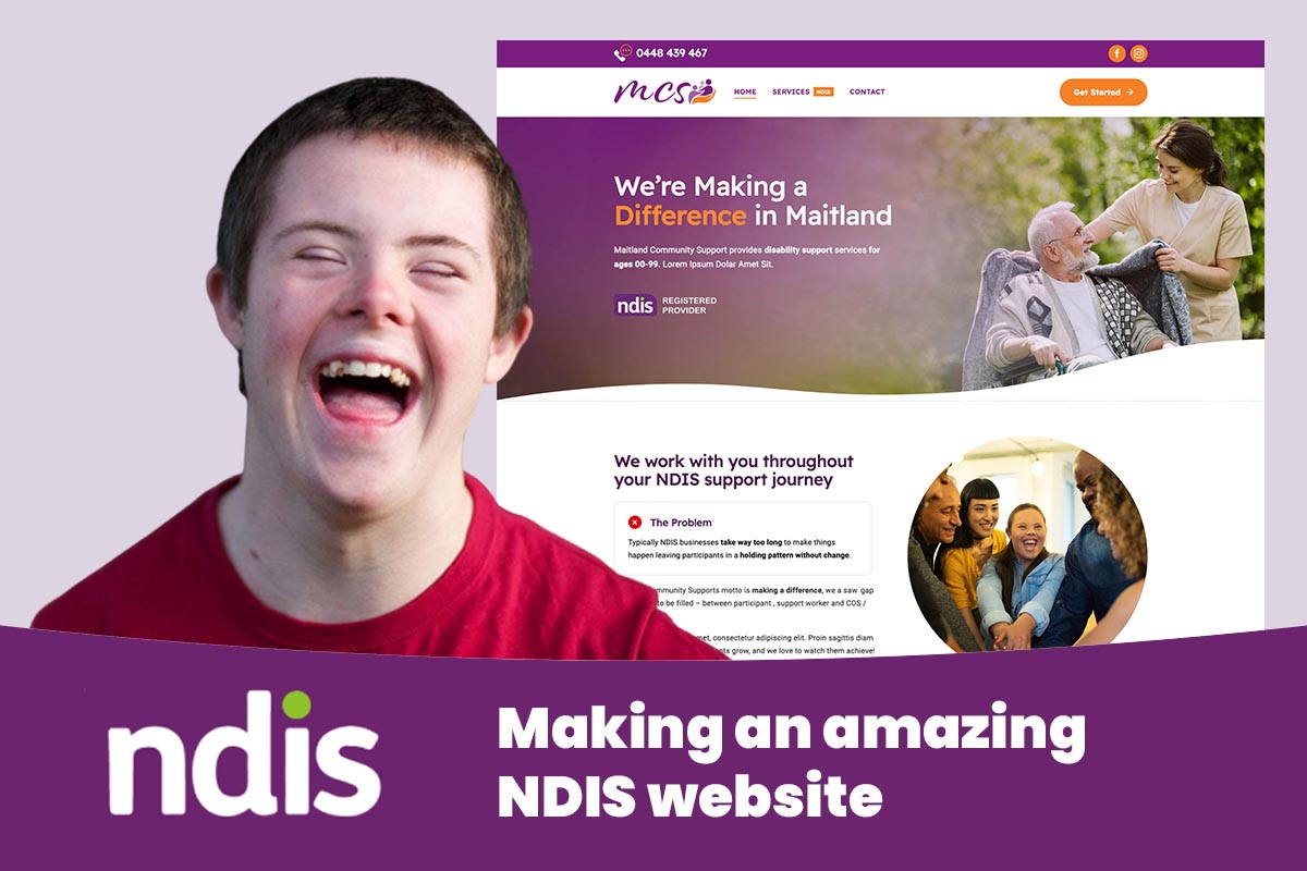
A person searching for disability support isn't browsing casually. They might be a participant weighing up their own options, a parent researching support for their child, or a support coordinator comparing providers against a deadline. Your website is often their first real interaction with your service — if it's confusing or hard to read, they'll assume the service itself will be too. NDIS website design carries more weight than a typical small business site, because the stakes here are personal.
Who actually visits an NDIS provider's website
Before touching fonts or colours, picture who lands on the site.
- Participants themselves — some navigating with vision, hearing, cognitive or motor disabilities. They need content that's easy to read and operate, and doesn't assume prior NDIS knowledge.
- Family members and carers — often researching late at night, tired, comparing providers quickly. They want plain answers: what do you do, where, and how do we start?
- Support coordinators and plan managers — researching on someone's behalf, often across many providers in one sitting. They need to find your services, coverage area and registration status fast.
Three very different visitors, one homepage. Structure content so each finds what they need without wading through the rest — a clear services overview near the top, a straightforward referral path, information organised by task. Our website planning guide is a good starting point before a redesign.
Accessibility isn't optional here — it's the whole point
Every business benefits from an accessible website. For an NDIS provider, it's existential — a meaningful share of visitors rely on assistive technology, and a site that fails on accessibility locks out the people you exist to support.
In practice, that means:
- Strong colour contrast so low-vision users can read your content.
- Text that resizes without breaking the layout.
- Full keyboard navigation for people who can't use a mouse or touchscreen.
- Alt text on every meaningful image, so screen readers can describe what's there.
- Captions on video content, for Deaf and hard-of-hearing visitors.
- Visible focus states so keyboard users can see where they are on the page.
- Never relying on colour alone to convey meaning — marking a required field with an asterisk and a label, not just a red outline.
This is a summary, not the full technical picture. For the detailed standards and how to test your site, read our full website accessibility guide — treat this section as the NDIS-specific reason accessibility matters here most.
Write like you're talking to a person, not a policy
NDIS terminology trips up people who've been in the system for years, let alone someone just starting out. Registered versus unregistered, plan-managed versus self-managed versus NDIA-managed, support categories, service agreements — a website that assumes fluency in all this will lose people fast.
Good NDIS website copy translates for the visitor:
- Explain what a service involves before naming it. "Help with showering, dressing and meal prep — what the NDIS calls Assistance with Daily Life" beats leading with the category name alone.
- Avoid stacking acronyms. If you must use one (NDIS, SIL, SDA), spell it out the first time it appears.
- Keep sentences short and warm. Write about people, not "clients" or "cases".
- Avoid corporate distancing language ("stakeholders", "service delivery outcomes"). Say what you actually do, in the words a family would use.
This isn't dumbing content down — it's respect. Clear language means fewer confused phone calls and more people confident enough to reach out.
The features an NDIS provider website genuinely needs
Beyond good writing and accessible design, a handful of features are close to non-negotiable for this industry:
- Clear NDIS registration status. If registered, state it plainly rather than burying it in a PDF. If unregistered, say clearly that you can support self-managed and plan-managed participants.
- Services mapped to support categories, in plain English. List what you offer, then note which NDIS category it sits under.
- Clear service area coverage. Name the actual suburbs, towns or regions you service — "servicing the local area" doesn't help anyone deciding whether to enquire.
- A low-friction enquiry and referral form. Coordinators often submit several referrals a day; a short form with a document attachment option gets used, a long one gets abandoned.
- A staff or team page covering qualifications and safety screening — such as Working with Vulnerable People or NDIS worker checks — described generally, not reproducing certificate numbers.
- Multiple accessible contact options — phone, email and a simple form, plus interpreter, Auslan or translated information where relevant.
Getting these right matters as much as the visual design — see our why your business needs a professional website piece, and our how to choose a web design agency guide if comparing who builds it.
What an NDIS provider website must do
| Feature | Why it matters | Common mistake |
|---|---|---|
| Registration status shown clearly | Participants and coordinators need to confirm eligibility fast | Registration details hidden in a footer PDF or missing entirely |
| Services mapped to support categories | Helps families and coordinators match needs to your offering | Services listed by internal program name, not NDIS-recognised terms |
| Accessible design (contrast, text size, keyboard nav) | A meaningful share of your audience uses assistive technology | Low-contrast text, tiny fonts, no keyboard support |
| Plain-language content | NDIS jargon confuses even experienced participants and families | Dense, clinical or bureaucratic wording throughout |
| Simple enquiry/referral form | Coordinators need to refer quickly; families need low pressure | Long, complex forms with unnecessary required fields |
| Staff quals and screening checks shown | Builds trust that carers are safe and qualified | No information on staff background or screening at all |
| Service area clearly stated | Visitors need to know if you cover their suburb or region | Vague "we service the local area" with no specifics |
Local search: how families and coordinators actually find you
Most people searching for disability support search locally and specifically — "NDIS provider Logan", "disability support worker near me", "NDIS personal care Newcastle". If your site and Google Business Profile don't clearly state where you work, you won't appear for these searches.
For a provider covering a region like Logan, QLD, that means:
- A clear statement of your service area on the homepage and Google Business Profile, not just your head office suburb.
- Separate pages for each distinct service area you cover — a Logan page and a Beenleigh page, say — with genuinely local detail, not the same text with the suburb swapped.
- Consistent business name, address and phone details across your site and Google Business Profile, plus genuine reviews, since families often check these before visiting your site.
If local search isn't bringing in enquiries, our guide on why your website isn't generating leads covers the common causes.
Trust signals that matter more here than almost anywhere
Corporate polish alone won't reassure a parent choosing who supports their child. Families look for warmth and genuine care, alongside proof of competence and safety:
- Registration status and screening checks, described honestly.
- Years supporting the community, if genuine — a steady history says more than any slogan.
- Photos and testimonials that feel real — your actual team and real quotes from families who've agreed to share them, never generic stock imagery or words written on their behalf.
- A tone throughout that sounds like a person who cares, not a policy document.
Common mistakes NDIS provider websites make
- Dense, bureaucratic language copied from funding documents instead of written for the reader.
- Poor accessibility — low-contrast text, tiny fonts, missing alt text, video without captions — especially damaging for this audience.
- No clear registration or service information, leaving visitors to guess or phone for basics.
- Complicated enquiry forms that ask for far more than needed up front.
- Impersonal stock photography that undermines the warmth this industry depends on.
- Forgetting mobile and screen reader users, when a large share of visits happen on a phone. Our small business website checklist covers the fundamentals worth auditing against.
Key Takeaways
- NDIS website visitors include participants, families and support coordinators — each needs different, clearly organised information.
- Accessibility (contrast, text size, keyboard navigation, alt text, captions) is essential, not decorative, for this audience.
- Plain-language content that explains NDIS terms as it uses them builds trust faster than jargon ever will.
- Clear registration status, services by support category, and a simple enquiry form are must-haves, not extras.
- Local search matters — service area pages and an accurate Google Business Profile bring in real referrals.
- Genuine warmth and safety signals matter as much as polish for this audience.
Frequently Asked Questions
What makes NDIS website design different from a regular business website?
The audience includes people with vision, hearing, cognitive or motor disabilities, plus family members and coordinators researching on someone's behalf. Accessibility and plain language aren't nice extras here — they're core requirements, alongside clear registration and support category information.
Do I need to meet WCAG accessibility standards on my NDIS website?
You should aim to, even if it isn't strictly mandated for your organisation. Given how many visitors rely on assistive technology, meeting recognised standards is simply good practice. See our website accessibility guide for the detail.
Should I explain the difference between registered and unregistered providers on my site?
Yes. Many families aren't sure what the distinction means, so a short, plain-language explanation removes confusion. If registered, state it clearly; if unregistered, explain you can still support self-managed and plan-managed participants.
What should go on an NDIS provider's homepage?
A plain-language summary of what you do, who you support, your service area, registration status, and one obvious way to get in touch. Support coordinators need to find this within seconds, not after scrolling several pages.
What's the best way to build trust on an NDIS provider website?
Combine clear facts — registration, qualifications, screening checks — with genuine warmth: real photos, honest language and, where possible, real testimonials from families who've agreed to share them.
How do I make my enquiry form easier for support coordinators to use?
Keep it short, ask only for what you need, and allow a document attachment for referral details. A form that takes thirty seconds gets used; one that takes ten minutes often doesn't.
Get a website that works for the people who need it most
An NDIS provider's website has a job beyond looking professional — it needs to genuinely work for participants, families and support coordinators, some relying on assistive technology just to read the page. If you'd like a website that's accessible, plain-spoken and built around how your community searches and enquires, have a chat with Pixel and Pine.